Claude
Claude Designed This Carousel. Here Is the Prompt and the Starter File.
I gave Claude two government pages and a carousel I liked, then asked for six finished slides. The exact prompt, the starter file, and the one step I still do by hand.
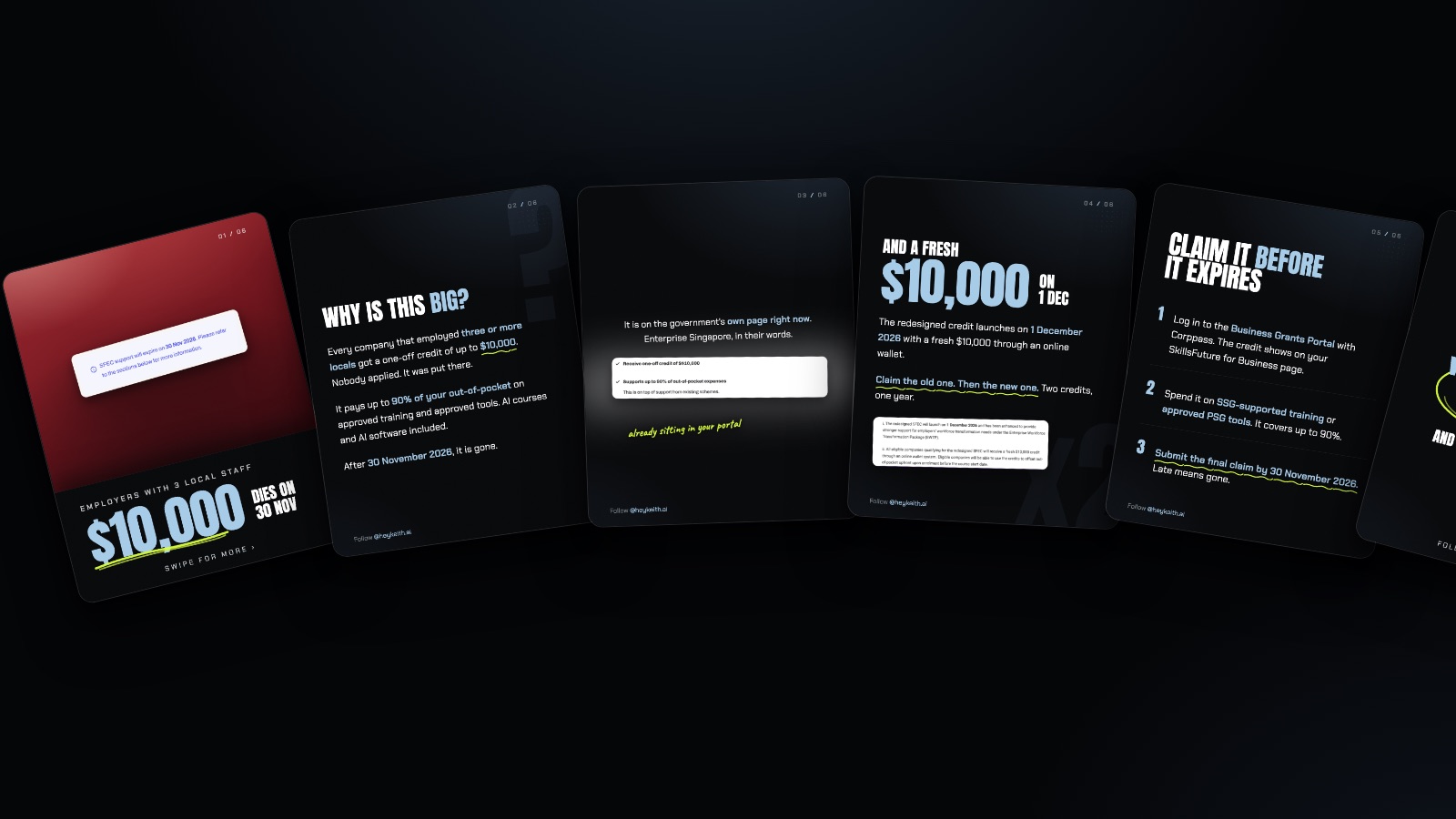
A polished, on-brand social post from an experienced designer or agency costs $40 to $150, according to ManyPixels' own pricing breakdown. I never opened a design tool for the carousel in this post. I gave Claude two government web pages and a carousel I liked the look of, and it came back with six finished, ready-to-post slides in that exact style. The prompt, the starter file behind it, and the one step I still refuse to skip are all below.
How Much Does a Designer Actually Charge for One Post?
That $40 to $150 figure is ManyPixels' own number, published in July 2026, and it is for a single polished post, not a whole campaign. Go through an agency instead and the range moves up again. None of that's a knock on designers. It's just the price of the thing I used to think I needed a design tool for, and didn't.
What Did I Actually Ask Claude to Do?
Three things, in this order, and none of them needed a mouse.
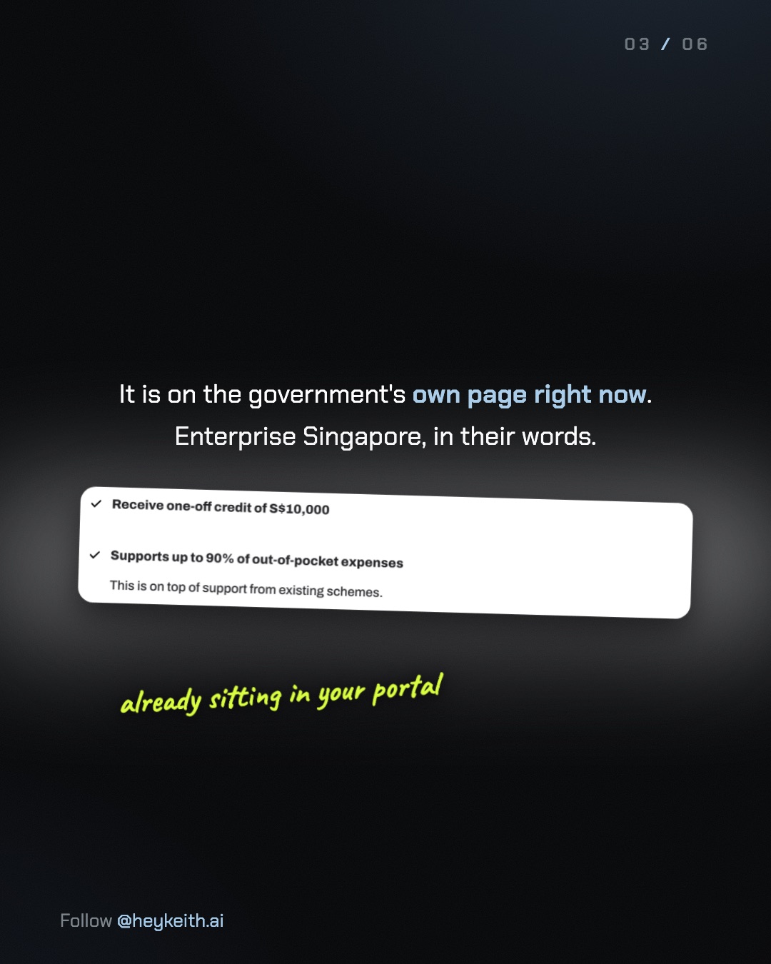
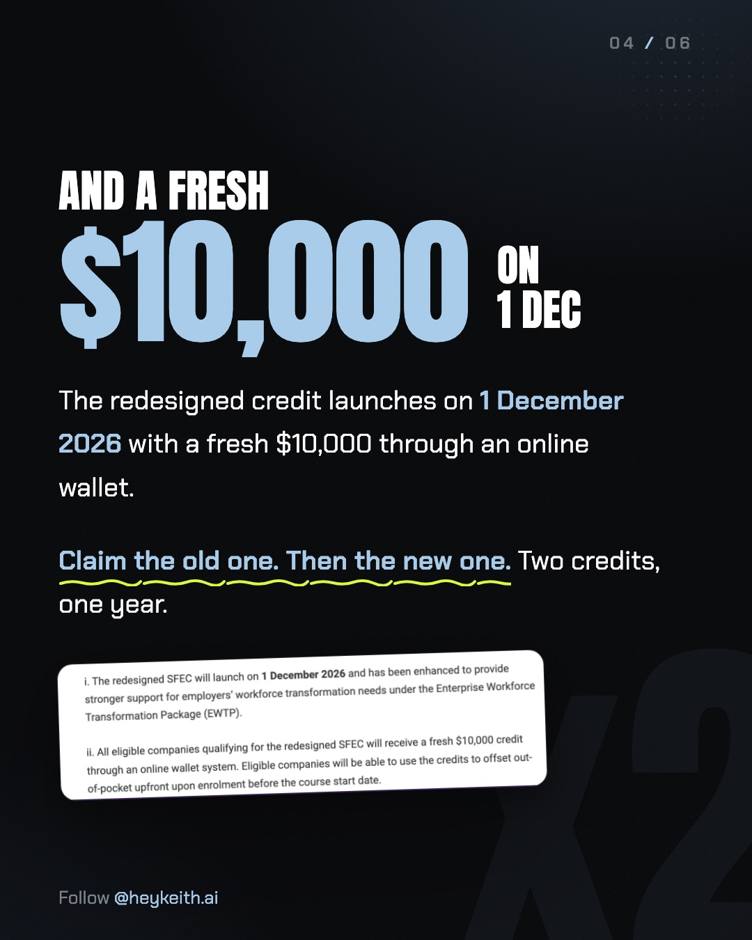
First, I gave it the post and the pages, and it grabbed its own screenshots. The subject was the SkillsFuture Enterprise Credit, so I pointed Claude at the EnterpriseSG SFEC page and the SSG memo announcing the redesigned scheme. It read both, then captured the exact lines it planned to use as proof rather than a screenshot of the whole page. That matters more than it sounds. A screenshot of a government page isn't evidence of anything by itself. A screenshot of the one line that says "$10,000" and the one line that says "30 Nov 2026" is.
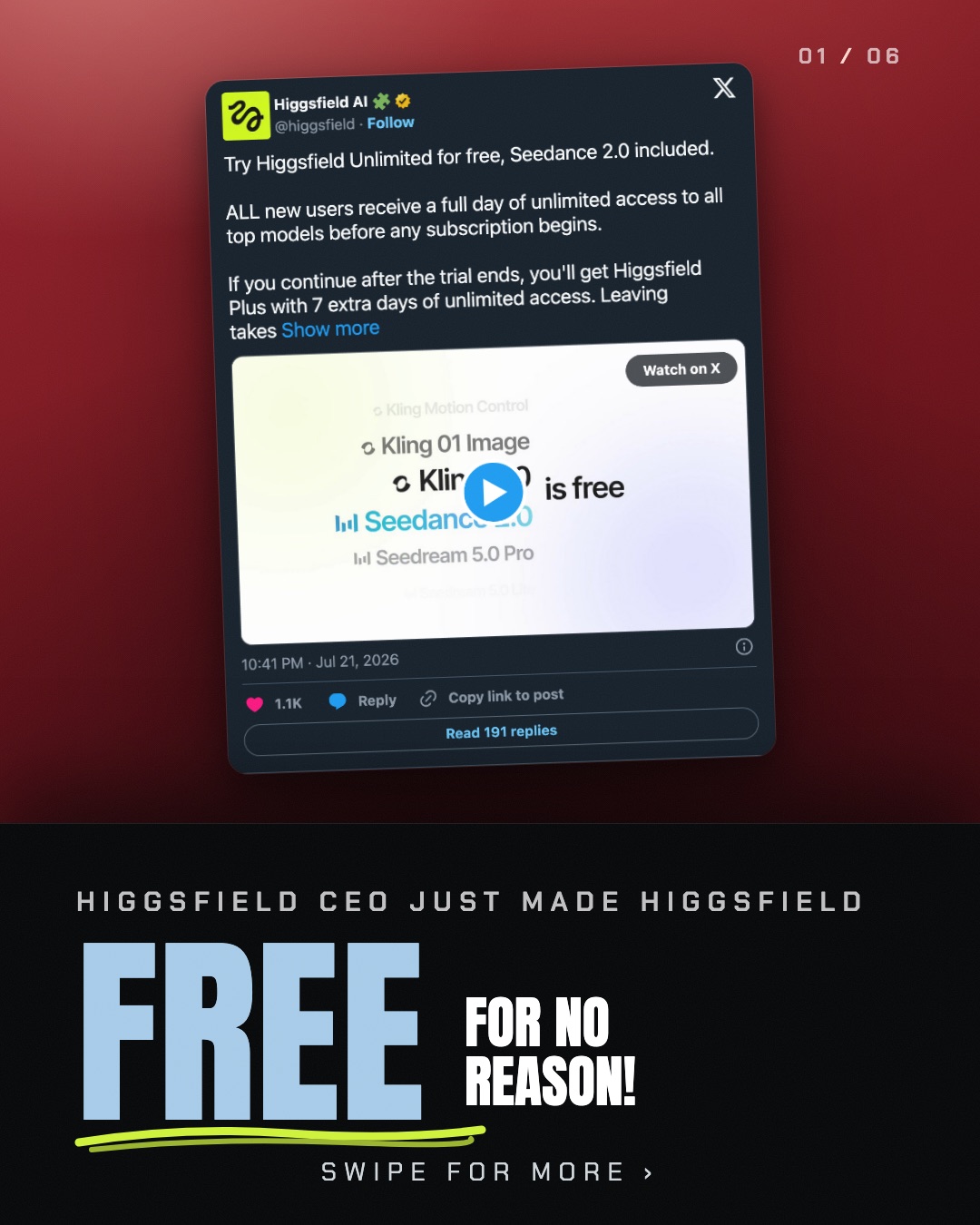
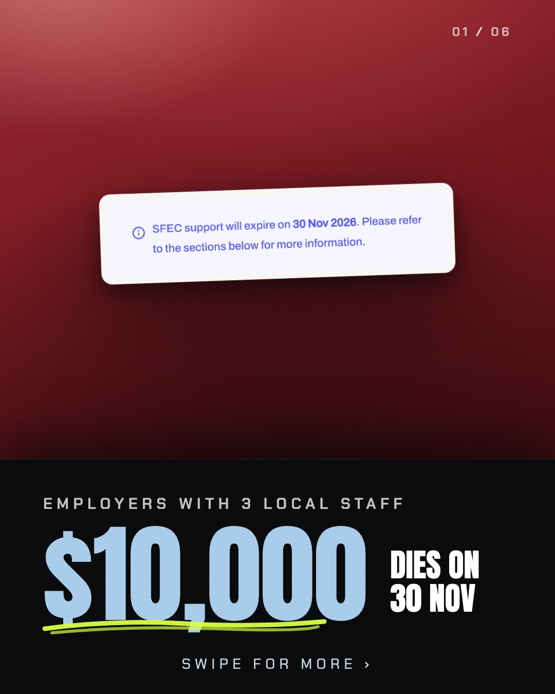
Then I showed it one carousel I liked, and it copied the colours, fonts and layout. Not a mood board, one actual carousel of mine from July. Same dark ground, same red hero slide up top, same light steel blue for the numbers that matter, same hand-drawn acid yellow squiggle under the one phrase per slide worth underlining.
One honest correction here, because I said something slightly wrong on camera. I said Claude "designed" the post, and that's true, but it didn't reach for some special built-in design feature to do it. It read one file, a page of my own notes that spells out exactly which font is the headline, which blue is the number colour, and how many degrees a screenshot card should tilt. That file is doing as much work as the model is.
And I asked for six slides, and it wrote them, laid them out, and handed back six pictures. Not a script and not a mockup. Six finished 1080 by 1350 images, rendered and ready to post, each one checked against the two source screenshots so no slide said a number the pages didn't.
What Is the Exact Prompt?
People kept asking for the exact prompt, and I want to be straight about what that means. I didn't save the request as one tidy text file on the day I wrote it, so what follows is that same ask, written out in full, the three things in the same order I actually gave Claude, working from the same two source pages.
Here is the post and the two pages behind it. Read them, then screenshot
only the exact lines you plan to use as proof, not the whole page:
- https://www.enterprisesg.gov.sg/financial-support/skillsfuture-enterprise-credit
- https://www.tpgateway.gov.sg/resources/announcements-and-circulars/ssg-information-memorandum-eed-2026-1

Here is a carousel I like the look of (starter file attached). Copy its
colours, its fonts and its layout exactly: the dark ground, the red-to-black
hero slide, light steel blue for numbers, acid yellow for the one hand-drawn
underline per slide, the slide index in the top corner.

Now write six slides in that exact style, one idea per slide, using only
what is in the screenshots above, nothing you are guessing at. Slide 1 is
the hook. Slide 6 is the comment-to-DM call to action. Render each slide at
1080 by 1350, one image per slide, no more than two sentences on any slide.
That's the whole ask, one request that never split into a separate copywriting pass or a separate design pass. Three parts, six images back.
What Is the Starter File?
The "carousel I liked" from step two isn't a secret. It is a single HTML file with the fonts, colours and card styling written as plain CSS, six <section> blocks, one per slide. I cleaned a copy of it, swapped the real content for placeholders, and put it up so you can start from the exact same file: the starter file.
<section class="slide s1">
  <!-- Slide 1, the hook: a screenshot card over a colour wash,
       the headline lockup in the black band underneath. -->
  <div class="s1-top">
    <div class="card"><img src="assets/your-screenshot.png" alt=""></div>
    <div class="idx">01 / 06</div>
  </div>
  <div class="s1-band">
    <div class="kicker">[Who this is for]</div>
    <div class="anton h-huge">[The one number that matters]</div>
    <div class="swipe">Swipe for more ›</div>
  </div>
</section>
Open the full file in a browser to see all six slides at once, or hand it to Claude the same way I did: here's a carousel, copy the look, now write me six slides about something else entirely.
What Did Claude Actually Make?
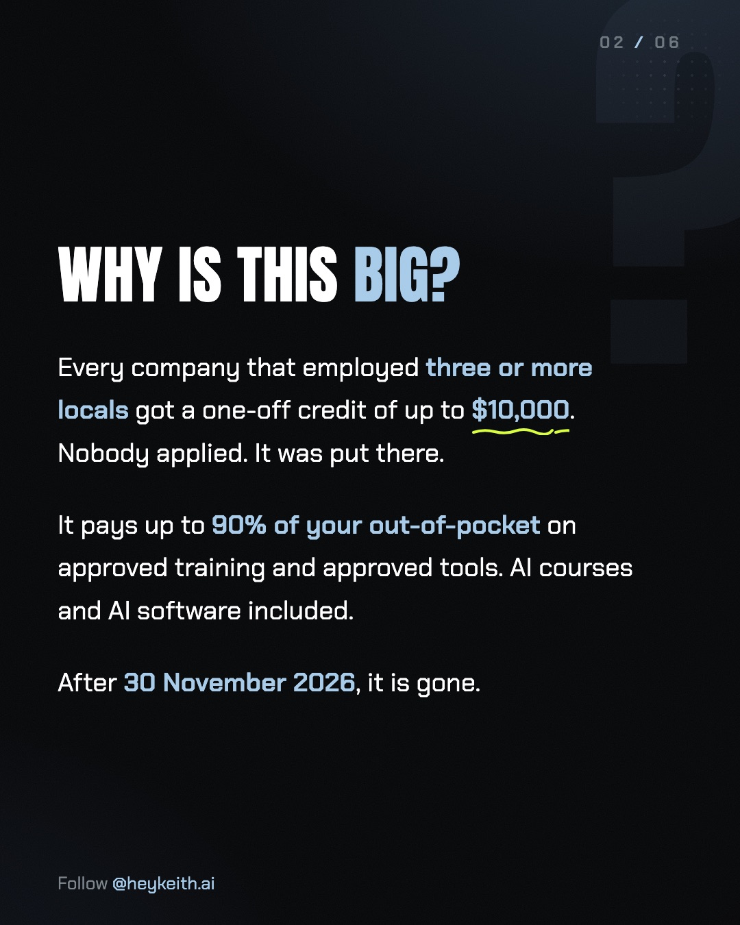
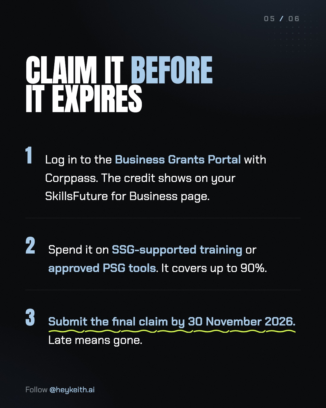
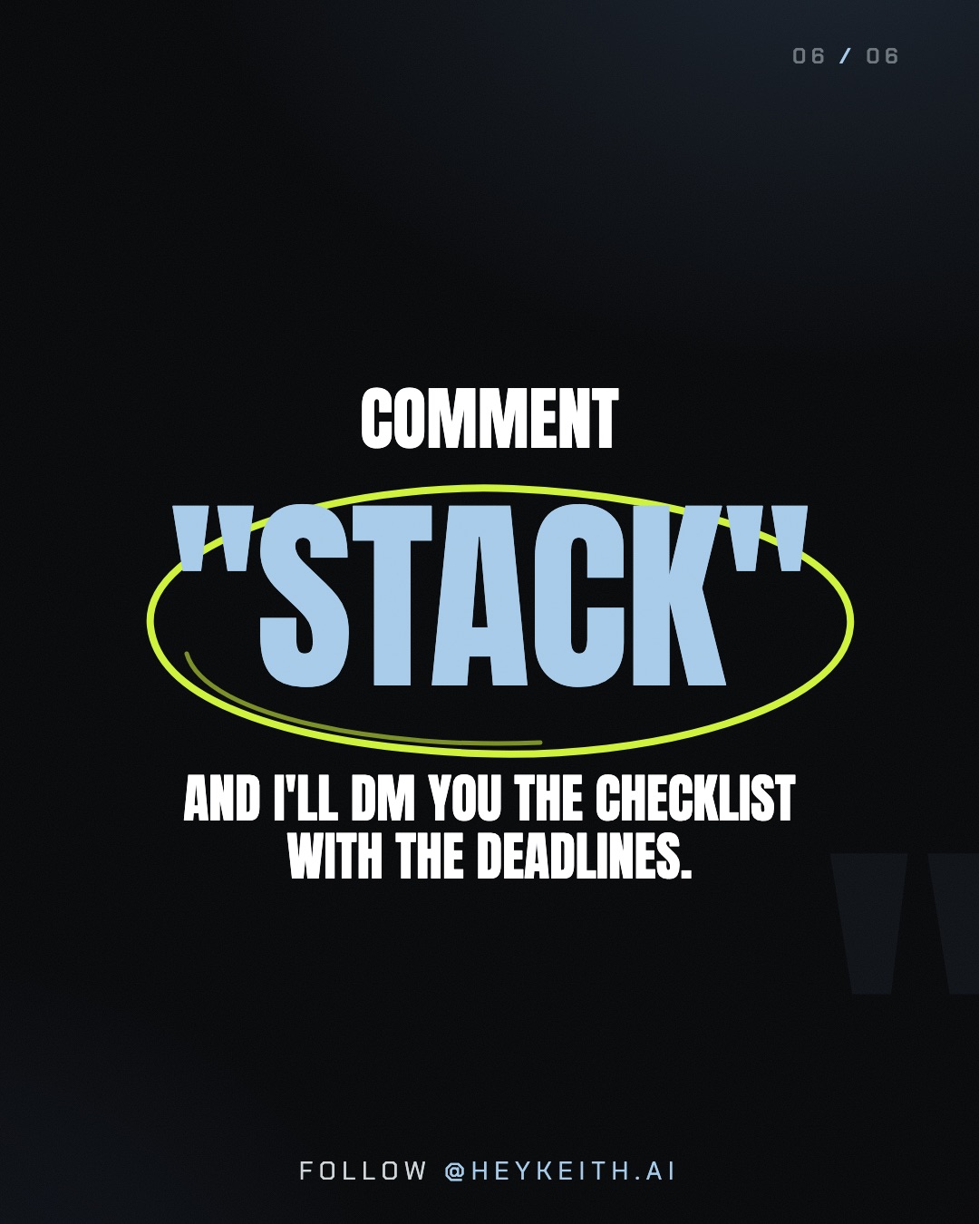
Six slides, in order, built entirely from the two screenshots above. This is the actual set, not a mockup of it.
What Still Needs a Human?
One catch, and it is the whole reason I still open every deck before it goes anywhere near post. Claude will render a slide that reads clean, sits inside the style perfectly, and states a number with total confidence. Confidence isn't the same as correct. On this deck, the first pass left a dangling single word on three of the six slides and a label sitting in the wrong spot on a fourth, the kind of thing that's easy to miss on a phone screen and ugly once you notice it. Fixing it took one more look, not a redo.
The bigger version of the same catch is the facts. A carousel about a government deadline lives or dies on whether "$10,000" and "30 Nov 2026" are actually what the source says, not what sounded right. That's why the screenshots are screenshots of the government's own page and not a paraphrase of it, and it's why I read every slide against those screenshots before anything gets posted. The prompt gets you most of the way there. It doesn't get you out of reading your own post.
The three-step version
- Give Claude the post and the source pages. It screenshots the exact lines it plans to use as proof.
- Show it one carousel you like. It copies the colours, fonts and layout, not the words.
- Ask for six slides. It writes, lays out and renders six images, one idea per slide.
- Read every slide against the source screenshots before it goes up. This is the step a prompt cannot do for you.
FAQ
Do I need Claude's built-in design tool to make these carousels?
No. This ran in a plain chat with a reference file attached, the same starter file this post links to. Nothing here used a dedicated design feature.
Does the screenshot step work on any web page?
It works on public pages Claude can actually load. Government pages, pricing pages, announcement pages all worked cleanly for this deck. A page behind a login is a different problem, and I'd screenshot that one myself and hand Claude the image.
What if I don't have a carousel style I like yet?
Start from the starter file. It carries the same dark skin as this deck, with placeholder copy where the real content goes.
Can Claude get the facts wrong?
Yes, which is the entire reason for the read-every-slide step. It's very good at matching a style and laying out text. It's not a substitute for checking that the number on the slide matches the number on the source.
Does this only work for scheme and deadline posts?
No, though it's a good fit for them, since those posts live or die on two or three real numbers. The same three steps work for any post built around real evidence: a pricing comparison, a product screenshot, a quote from a real page.