web design
20 Signs a Website Was Made by AI
The visual tells that give away a generated website, from the purple-to-blue gradient to the glow that follows your cursor. What each one is, why models keep producing it, and what to use instead.
There's a look that generated websites keep landing on, and once you can name it you cannot stop seeing it. It comes from about twenty small defaults that every model reaches for because they were everywhere in the training data, and they tend to arrive together.
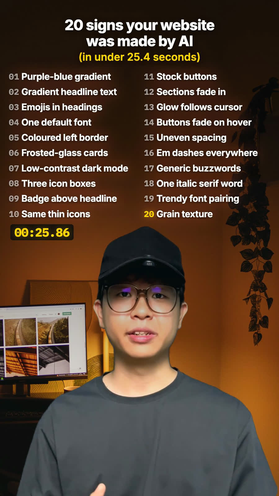
The full twenty, in the order they appear below:
purple-to-blue gradient · gradient headline text · emojis in headings · one default font · coloured left border · frosted-glass cards · low-contrast dark mode · three icon boxes · badge above the headline · the same thin icons · stock buttons · sections fading in · a glow following the cursor · buttons that fade on hover · uneven spacing · em dashes everywhere · generic buzzwords · one italic serif word · the trendy font pairing · grain texture
They're grouped by what kind of decision they are, colour, type, components, motion and finish, rather than ranked, because they don't arrive one at a time. A generated page usually ships six or eight of them at once and the grouping is what helps you find yours.
The colour tells
1. The purple-to-blue gradient. The single most reliable sign, and the one that dates a page fastest. Somewhere between violet and indigo, usually on the hero section, usually running diagonally. It became the default startup palette around 2020, spread through every framework template and landing-page gallery, and models absorbed it as simply what a modern website looks like. The tell is not that it's ugly, because it isn't. The tell is that it carries no information about the business using it. A law firm and a fitness app get the same background. Replace it with one real colour that belongs to this business, taken from its logo, its products or its premises, and the page immediately stops looking generated.
2. Gradient headline text. The same gradient clipped inside the letters of the big heading. It reads as decoration applied to type rather than as typography, and it almost always costs legibility, because the lighter end of the gradient is fighting the background. On a phone in sunlight, half the headline disappears. Solid ink for headlines, always, and if you want emphasis put it in the words.
7. Low-contrast dark mode. Mid-grey text on slightly-less-mid-grey background. It looks sophisticated on a calibrated monitor in a dim room, which is exactly where it gets designed, and it becomes unreadable on a phone outdoors. Beyond taste, it's a straightforward accessibility failure, and the most common one on the web.
The typography tells
3. Emojis in headings. A rocket next to "Fast", a lock next to "Secure", a sparkle next to anything involving AI. It reads as a 2019 pitch deck. The deeper problem is that an emoji in a heading is usually compensating for a heading that doesn't say anything: if "🚀 Fast" needs the rocket, the real fix is a heading that states how fast, compared to what.
4. One default font everywhere. Inter, or whatever the framework shipped with, used at three weights with no real contrast between them. Nothing is wrong with Inter. The tell is uniformity, because a page set entirely in one neutral sans at similar sizes has no hierarchy, so everything reads as equally important, which means nothing draws the eye. Pick a display face for headings with actual personality, or at minimum open up the size and weight gap so the page has a shape.
16. Em dashes everywhere. The tell people now spot fastest, because it migrated out of AI writing and into AI layout copy. A comma, a full stop or a rewrite does the same job. If you've got three in a paragraph, the paragraph is doing too much in one breath.
17. Generic buzzwords. Seamless, robust, elevate, empower, cutting-edge, leverage, innovative. Each one is a sentence that forgot to say what the business does. The test is brutal and quick: could a competitor put this exact sentence on their site without changing a word? If yes, it's saying nothing. "Seamless integration with your workflow" becomes "It reads your existing spreadsheet, so you don't re-enter anything."
18. One italic serif word for effect. A single word set in an italic serif inside an otherwise sans-serif headline, meant to signal craft and warmth. It worked beautifully for about eighteen months. It is now the most common way of signalling craft, which means it signals the opposite, and models produce it constantly because the training data is full of it.
19. The one trendy font pairing. Whichever display-plus-sans combination was on every design roundup that year. It dates a site to a specific few months, the way a particular shade of teal dates a kitchen. Not a crime, just legible as a choice somebody else made.
The component tells
5. Cards with a coloured left border. The four-pixel accent stripe down the left edge of a box. It's a Bootstrap alert component wearing a suit, and it appears because it's the cheapest way to make a plain rectangle look considered. If the content in the box matters, give it real hierarchy instead: a stronger heading, more space around it, or an actual image.
6. Frosted-glass cards. Semi-transparent panels with a backdrop blur, stacked over a gradient. It was genuinely beautiful when Apple popularised it and it's now a default. The practical problem is that the blur destroys contrast between the card text and whatever is behind it, and it varies as the user scrolls, so there is no contrast ratio you can actually guarantee.
8. Three icon boxes in a row. Always three, always icon then heading then two lines of body, always weighted equally. Real businesses rarely have exactly three equally important things to say. The reason it's always three is that three fits a twelve-column grid cleanly, which is a layout reason masquerading as an editorial one. Say the number of things you actually have, and let the most important one be bigger.
9. A little badge above the headline. The small pill reading "AI-Powered" or "New" or "Backed by Y Combinator", floating above the hero. It's borrowed from launch pages where it carried real news. On most sites it occupies the single most valuable piece of space on the page with the least valuable sentence available.
10. The same thin icons everywhere. One outline icon set at one stroke weight, applied uniformly, usually a bit approximate to what it's labelling: a generic gear for "settings", a generic shield for anything about trust. Approximate icons are worse than no icons, because the reader spends a beat decoding them.
11. Stock buttons nobody changed. The framework's default corner radius, default shadow, default hover state. The button is the single element people actually touch, the thing the whole page exists to get them to press, and it's routinely the last thing anyone styles. Give it the business's real colour, a deliberate size, and a press state that feels like something happened.
The motion tells
12. Sections fading in as you scroll. Applied to every section indiscriminately, so content simply isn't there until it decides to arrive. On a slow connection or with reduced-motion preferences it can mean a blank page. Scroll animation earns its place on one or two moments that deserve emphasis, not as a global default.
13. A glow that follows your cursor. The radial light that tracks the pointer across the hero. It's a party trick that stops being interesting on the second scroll, costs frames on an older laptop, and does nothing on mobile, where there is no cursor at all and most of your traffic is.
14. Buttons that only fade on hover. Opacity dropping to 0.8, as the entire interaction design. It reads as unfinished because it is literally the default state before anyone made a decision. A hover should tell you the thing is pressable and where the press will land.
The finish tells
15. Uneven spacing. The real giveaway, and the hardest to fake your way past. Generated layouts mix spacing values with no underlying system, so the gap above one heading is 24 pixels, the next is 28, the one below is 32, with nothing choosing between them. Careful human work picks a scale, usually something like 4, 8, 16, 24, 32, 48, 64, and never deviates. This is the item that makes a page feel amateur while the viewer is unable to say why, and it's the one I'd fix first.
20. Grain texture. The noise overlay across the whole page, added to make a flat gradient feel filmic and analogue. It was a real and considered technique before it became the last step of every template. If the page underneath is generic, the grain doesn't rescue it, it just makes the generic slightly grainy.
Why models keep producing all this
None of these are bad ideas, and that's the part worth understanding properly.
Every single one was a genuinely good decision somewhere, on a site that needed it, made by someone who thought about it. That's exactly why it got copied enough to dominate the training data. A model asked for a modern landing page returns the statistical centre of every modern landing page it has seen, and the statistical centre of anything is by definition unremarkable.
So the fix isn't to avoid AI for design work. The fix is to give it something specific to be specific about. The difference between a generated site and a genuinely good one built with AI lies almost entirely in what you told it about the actual business: its real colour, its real photographs, its real numbers, its real customers, and the one thing it does that the competitor down the road doesn't. I wrote up how I actually build a site with Claude, and the whole method comes down to this problem, solved by refusing to accept the first thing it offers.
FAQ
Is it bad if my website has some signs of being made by AI?
Not on its own. Three is normal and nobody notices. Past about eight, the site starts to look like every other site your customer saw that week.
Which AI website sign should I fix first?
The spacing. Uneven spacing is what makes a page feel amateur without anyone being able to say why, and fixing it means picking one spacing scale and sticking to it.
Why do AI website builders keep producing the same designs?
Each one was a good decision on some real site, so it got copied until it dominated the training data. Ask a model for a modern landing page and you get the average of all of them.
Can I still use AI to design my website?
Yes. The difference is what you tell it about the business: its real colour, real photos, real numbers and the one thing it does that competitors don't.
How to use the list
Open your own site and go down it honestly. Three of these is normal and nobody notices. Eight or more and your site looks like every other site your customer looked at this week, which is the actual cost. Not that it looks AI-made. That it looks like nothing in particular, and gets remembered as nothing in particular.
Fix the spacing first, then the buttons, then the colour. Those three are cheap and they carry most of the impression.
And if you just had a site built for you, this is a fair list to send the person who built it, before you pay the final invoice.